

THE COMPANY
PROJECT
Alchemy is a clean beauty brand for badass ladies (and gents) who want to enhance their natural beauty with simple, organic products.
Brand Identity
Print
Packaging
THE BRIEF
Sought to create branding that was edgy and modern, but with a touch of medieval style to tie into the brand’s namesake and ethos.


Alchemy beauty specializes in natural anti-aging products such as serums, scrubs and moisturizers. The brand's target audience is women who are a little edgy and value the story behind the brand as much as the quality of the products - that inside each product is a little medieval magic helping turn back the sands of time. Storytelling is a key aspect of Alchemy's brand image. Which is why we pushed the typography and really explored textual layouts and poetic copy.

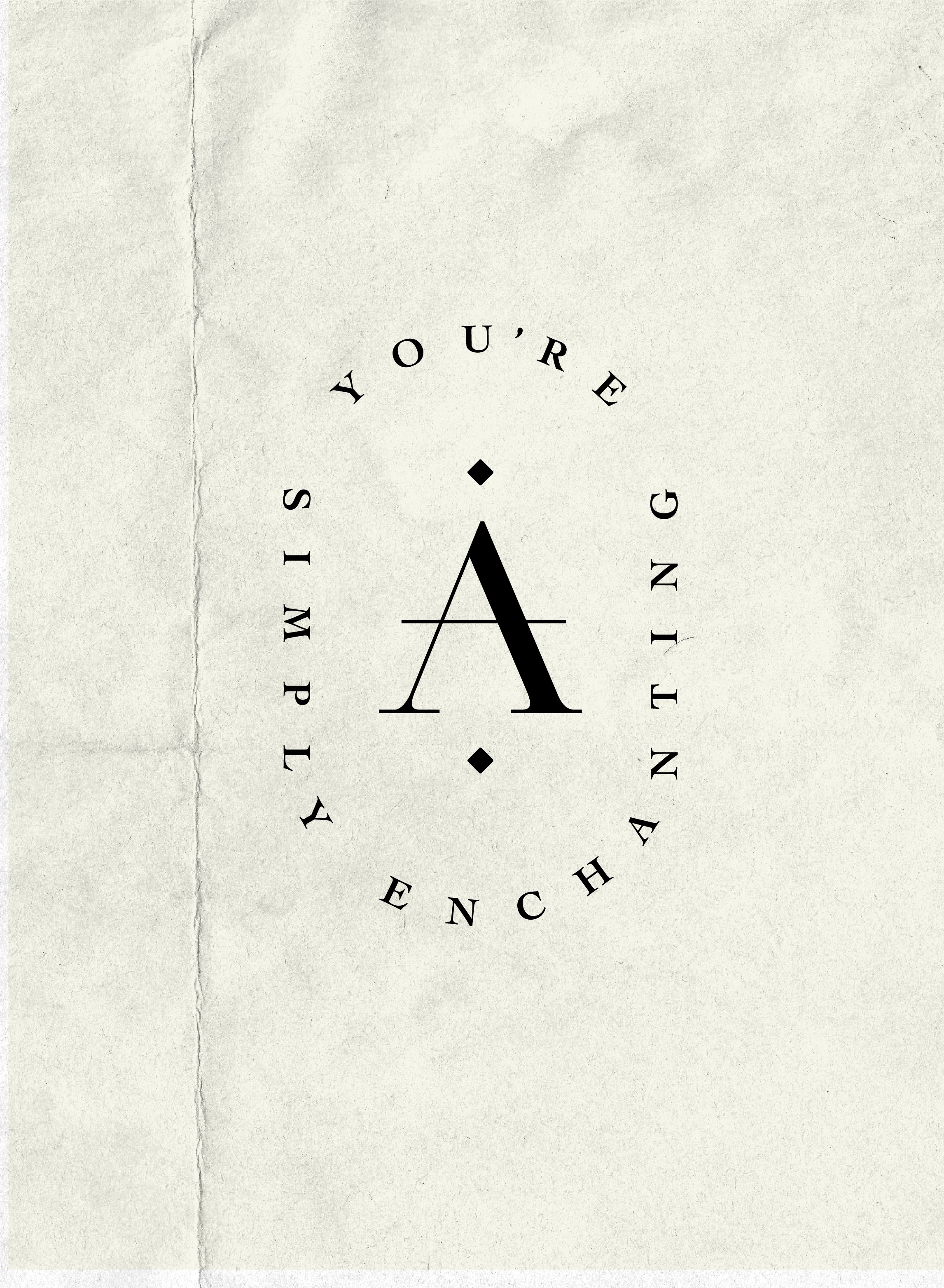


Medieval alchemy is the practice of mixing early science and mysticism. One of the cornerstones of alchemy was the belief in an elixir of life, which would grant eternal youth and health. This is the tongue-in-cheek foundation behind Alchemy Beauty. The logo itself is inspired by one of the four classical elements–air–with the custom “A” that’s been modified to look like the air symbol.